WestJet Branding

Year
2024
Client
WestJet
Service
Branding
This logo redesign reimagines WestJet’s visual identity by drawing inspiration from two elements that define the airline’s heritage and purpose: Canada and aviation. The concept is built around the maple leaf, Canada’s national symbol, which is transformed into a dynamic aircraft-inspired mark through a structured geometric system. By combining simplicity, symbolism, and movement, the redesign aims to create a modern identity that reflects WestJet’s growth while remaining connected to its origins.
© WestJet Branding


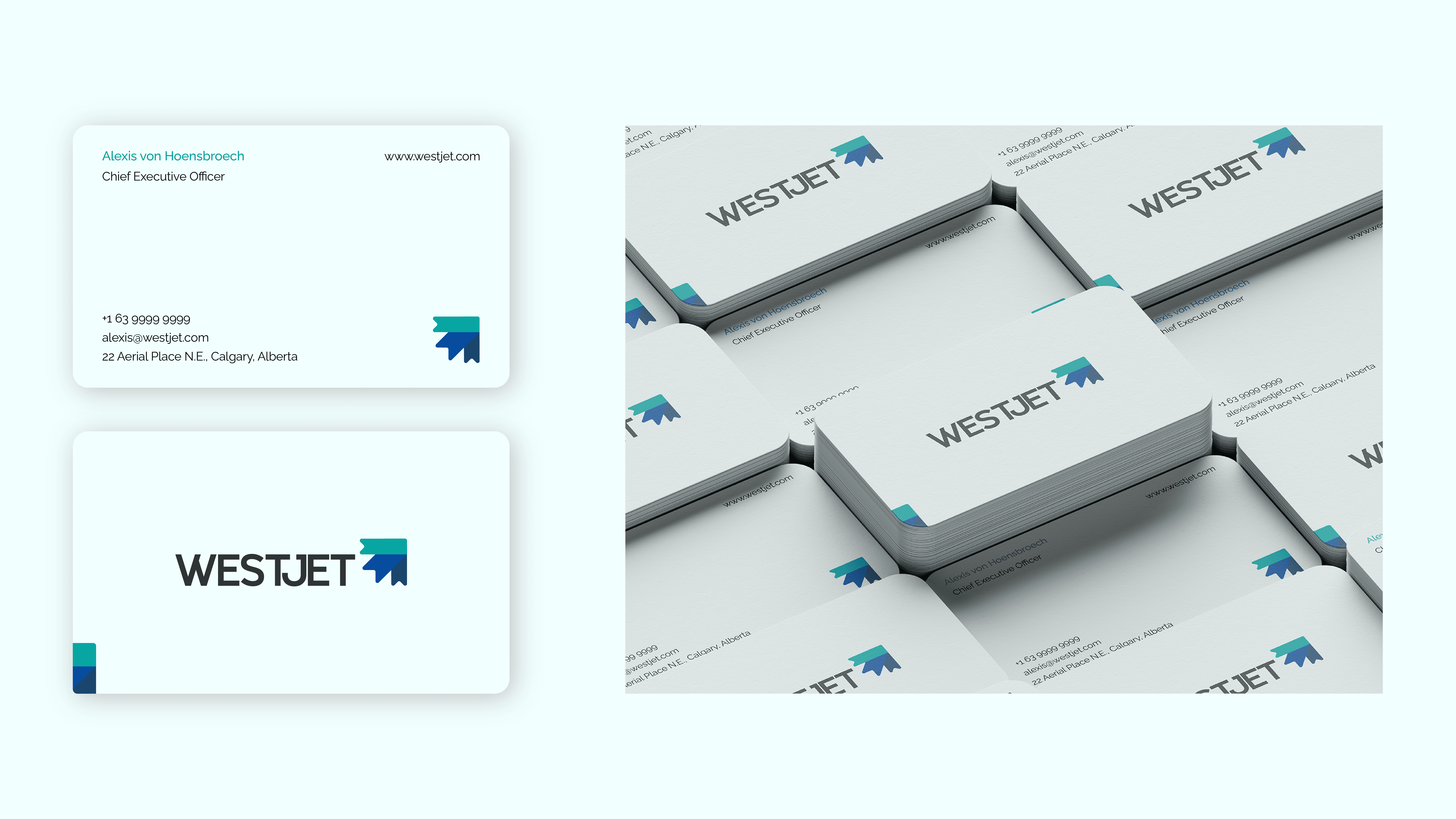




Logo idea:
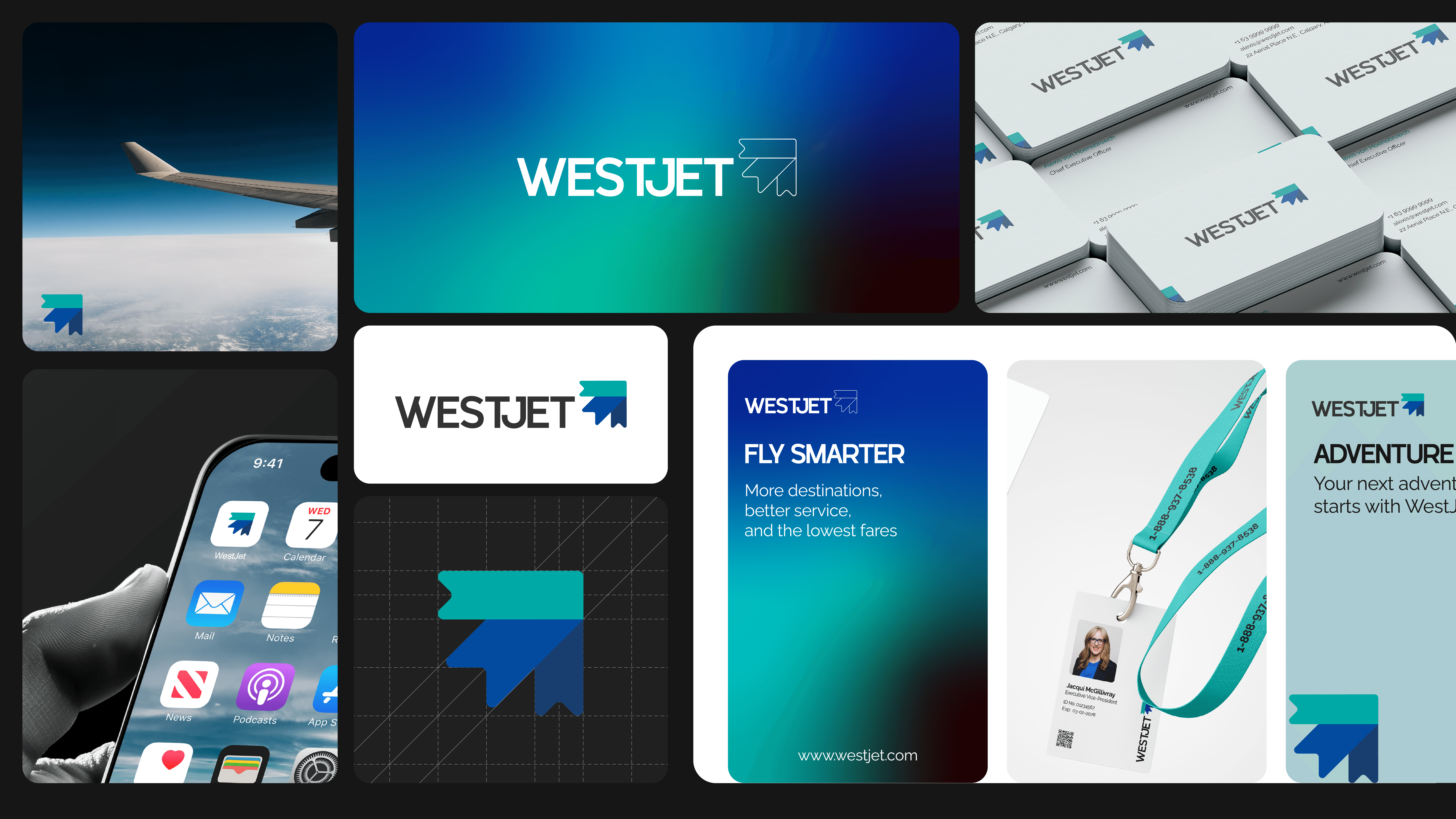
The logo mark is inspired by the maple leaf, Canada’s national symbol. To construct the logo type, I designed a grid system consisting of five 1×1 square rectangles (1=x). The maple leaf mark is formed by combining three shapes, each measuring 1x in width and 3x in length. The main shape is centrally aligned, while the two side shapes are rotated ±45 degrees vertically.
To form an airplane-inspired shape, the maple leaf mark is horizontally mirrored and rotated an additional 45 degrees. The leaf edges are rounded to 6 points, representing the number 6 from the company’s founding year, 1996, while also enhancing the design's balance and harmony.
The logo mark consists of three shapes, symbolizing the company's history when it began with three aircraft. This subtle design element connects the brand's identity to its roots while maintaining a modern and dynamic appearance.
The logo features three colors: turquoise, blue, and dark blue, symbolizing friendliness, comfort, and hope. While inspired by WestJet’s original color scheme, I have adjusted the tones to be slightly brighter, enhancing the modern and dynamic appearance of the logo.
Logo Type:
The logo type uses the iBrand Logo typeface, chosen for its precision and strong visual impact. The spacing between characters is adjusted to x/5 to create a balanced alignment with the logo mark. The distance between the logo type and the logo mark is set to x/3 for optimal proportion. Additionally, the bottom edge of the logo mark aligns with the bottom edge of the logo type, ensuring a cohesive and well-structured design.
About the company
Founded in 1996 in Calgary, Canada, WestJet started as a low-cost airline with just three aircraft and five destinations. Over the years, it expanded to become one of Canada's largest airlines, offering domestic, transborder, and international flights. WestJet's focus on affordable air travel, friendly service, and employee ownership has been key to its growth.
Vision
WestJet aims to be the most caring and people-driven airline by providing affordable, safe, and high-quality travel experiences. The company focuses on customer service, innovation, and sustainability, striving to connect people and communities while reducing its environmental impact.
Night in Auckland
When flowers begin to move